
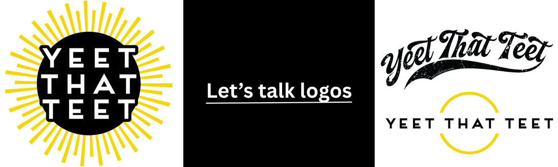
Let's Talk Logos
Three Logos, One Story
Branding isn’t a costume here; it’s a survival tool. Yeet That Teet was born from the gap between what people assume cancer looks like and what it actually is. Our visual language holds space for both the grit and the giggles.
The Varsity: We Before Me
The Varsity mark—the classic team letterform with a swoosh—turns the “cancer club” into a roster. Emotionally, it says: you’re not benched; you’re backed. Practically, it’s a workhorse: high legibility, strong silhouette, and instant recognition on hats, tees, and patches. It’s our community signal—patients on the field, allies in the stands, same team.
Brand note: High-contrast lettering and simple shapes win at distance (retail walls, vendor booths, event photos). The Varsity’s modular forms embroider cleanly and minimize print errors—less waste, more consistency.

The Broken Circle: The Pause That Saved Me
Our open-ended ring with “Yeet That Teet” running through it is a love letter to unfinished business. The gap represents the forced pause—diagnosis, treatment, grief, identity shifts—and the choice to resume on your own terms. The circle didn’t fail; it flexed to let life through.
Brand note: Negative space is powerful. The Broken Circle reads beautifully in one color, so it adapts across substrates and sizes (stickers to storefronts). It’s also a conversation starter—people point and ask, “Why is it open?” That’s the point.

The Sunburst: Light That Doesn’t Apologize
Goldfinch rays emanating from black. This isn’t saccharine sunshine; it’s the stubborn light you fight for. On dark fabric, it glows. In photos, it pops. In hard moments, it reminds you that hope can be loud.
Brand note: The palette’s contrast is intentional for accessibility and real-world legibility. It demands attention without shouting “awareness campaign.”
Why Black + Goldfinch (and why not Pink)
Black tells the truth about the dark. Goldfinch yellow is the quiet defiance that gets you home. We chose this palette to reject pinkwashing—the hyper-feminized, one-note storytelling that rarely fits those of us who don’t tie our womanhood to our breasts. Plenty of us opted out of reconstruction. Plenty of us are nonbinary, queer, or simply done being reduced to body parts. Our colors make room for that truth.
This isn’t anti-anyone; it’s pro-reality. If pink empowers you, wear it. If it doesn’t, you found a new clubhouse. YTT is here for the full spectrum of experience—messy, honest, and occasionally hilarious.
What to Wear, What It Means
- Varsity when you need the team at your back.
- Broken Circle when life feels interrupted—but not over.
- Sunburst when you want your hope to be visible from across the room.
Flat is valid. Humor is healing. Wear the movement.
For quick updates, find us on Facebook or Instagram.